Howl's web app was initially built as a minimum viable product. The demand and business needs outgrew the scope of the app.
I interviewed a crop of our most engaged users, most of whom had participated in previous studies. Groups is our flagship feature, enabling users to connect with nearby neighbors for a specific purpose.
We needed to understand the problem in a deeper way, and so we looked at our competitors for any overlap. Use cases helped us to see how their solutions worked, or didn't, for their users. At a minimum, it helped us to glean insights into how other products in the market served prospective users.
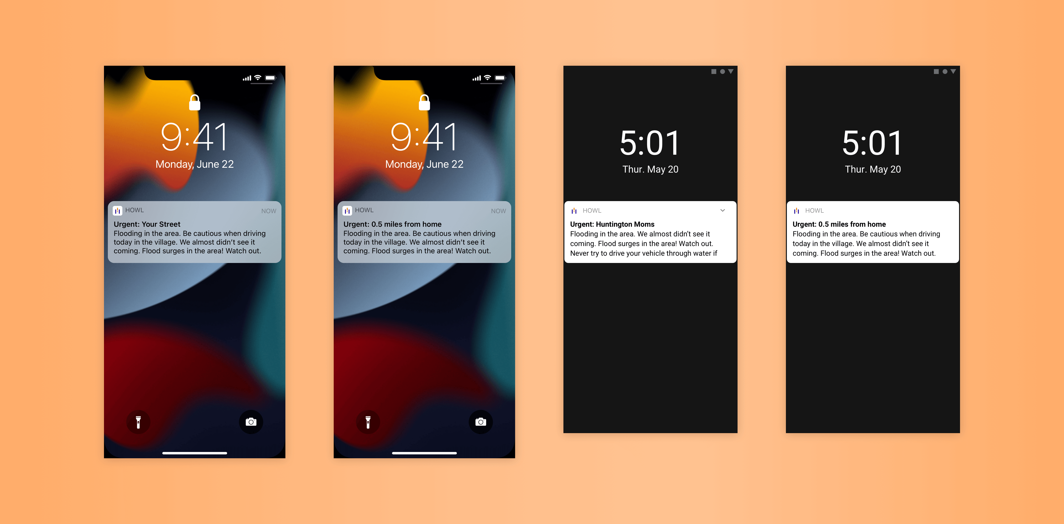
We also interviewed a handful of users from competitor platforms to understand how the current solutions were working for them. We discovered that competitor platform push notifications weren't serving users well. Either there were too many or too few. When there were too many, users would turn them off completely, and then miss out on important community updates.
Journey maps, touch points, task flows and user flows helped us to isolate areas of opportunity and clearly present the problem to stakeholders. This kickstarted ideation.
After initial ideation, we came up with two directions:
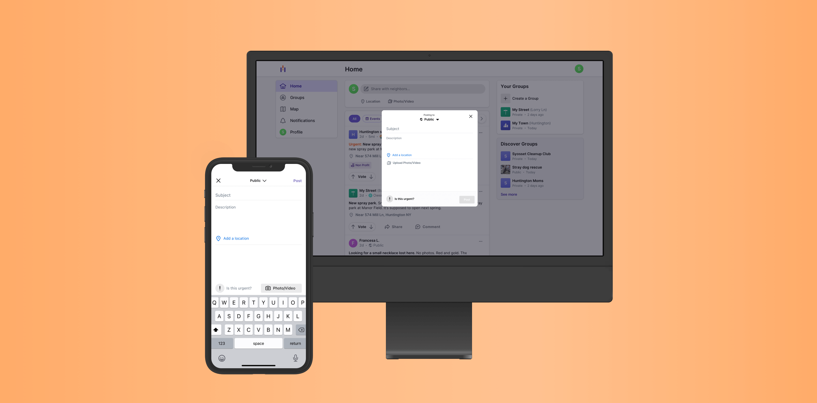
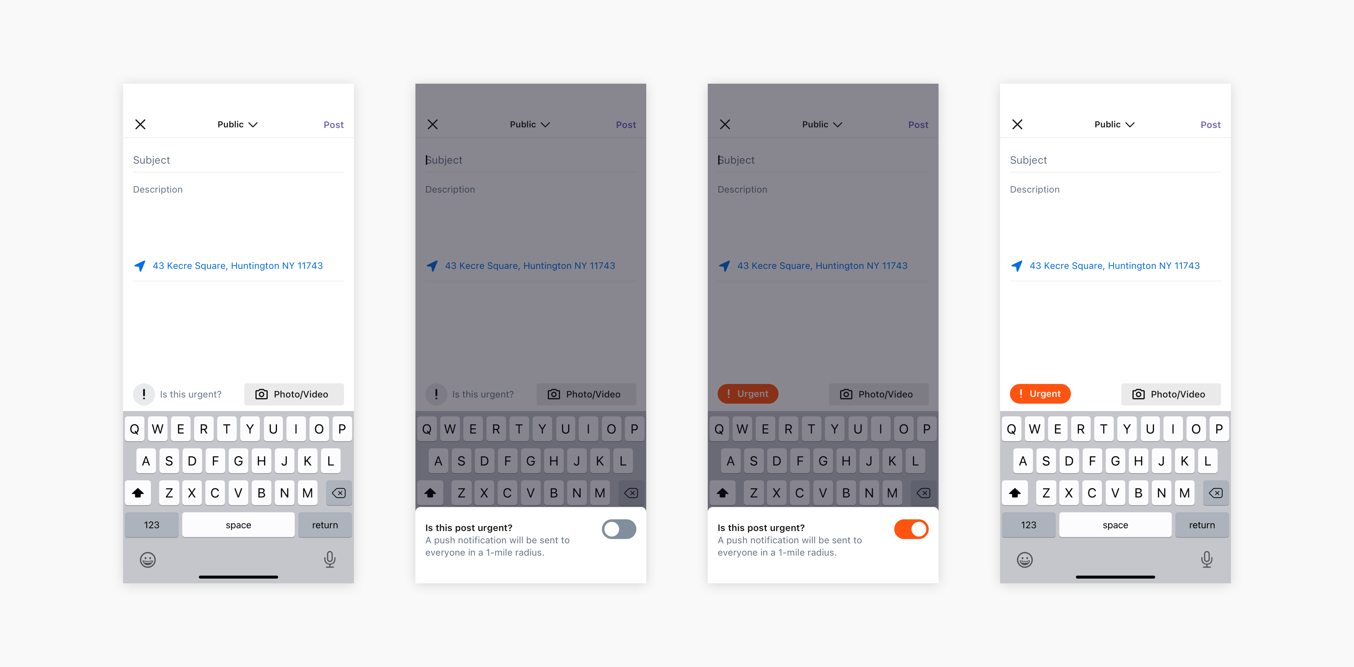
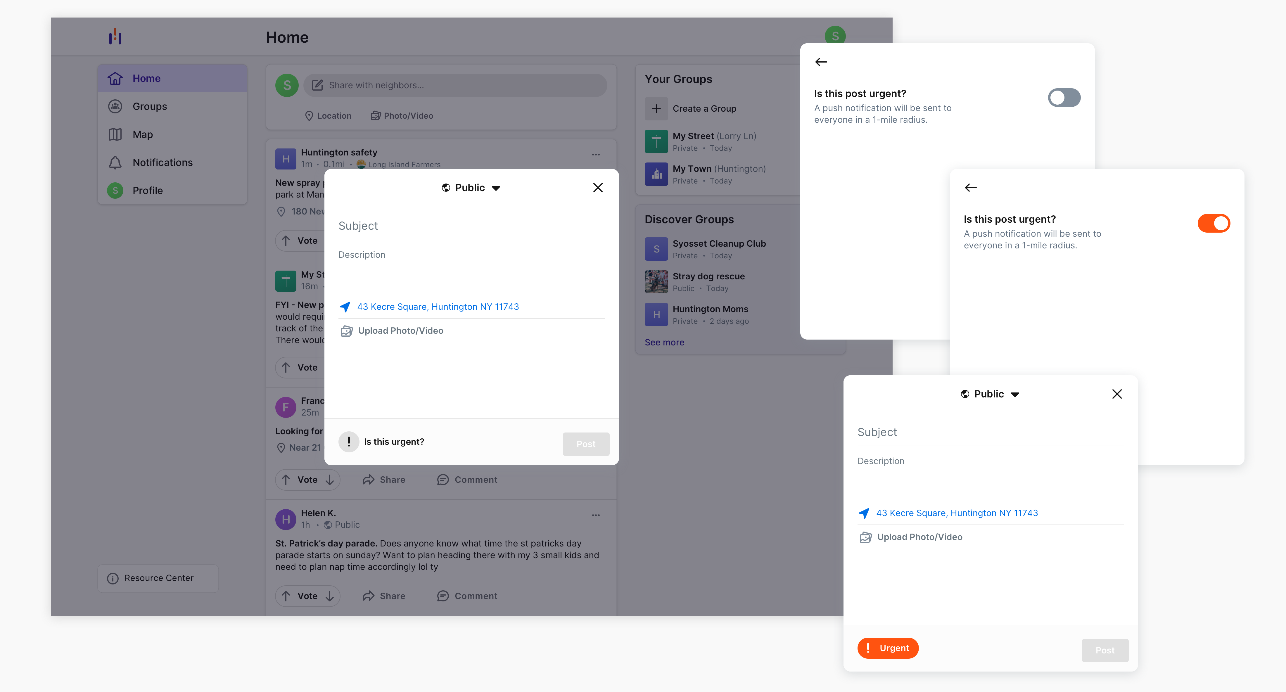
It was important to understand the technical and time constraints early. For group posts, the membership would be informed. For public posts, the notification would be hardcoded on the backend. We would check if the post is urgent or not. If it was based on whether the specific user wanted to see a notification, then it would take longer to implement and require backend work, which already had a full plate.
We conducted broad discovery research with users and prospective users. We got back in contact with users of competitor platforms and defined those users as "prospective". This helped us to gauge how users felt about our current notification system and check our assumptions surrounding the following ideas:
We plotted the two ideas on an impact effort matrix. Creating a new category of post empowered users to judge their own posts based on their content and context. Its implementation was also quicker, which enabled the team to address feature improvements that were discovered during the framing, testing, and design phases.
The 'on'/'off' feel and recognizability of a switch made it immediately appealing as a way to address this design challenge. The switch had to be easily accessible and immediately easy to understand. We assumed that the user in need of this feature was in a hurry to post. Therefore, the added value of augmenting the post needed to be worth any extra time required to make it 'urgent'. Prompting the user made the switch actionable. By posing a question, the functionality meets the user where they're at on a human level. The question also invites them to learn more if they are dazed or need more context, which we discovered during testing was appreciated.

Once we validated the usability of the design through testing, we looked to address insights we learned along the way. We grouped them into 3 categories based on impact and effort: improvements we could implement in the current sprint, improvements that we wanted to prioritize but that required an epic, and future considerations. We determined that solving for usability bugs offered the most value with the least effort. Building the lower effort solution from the beginning allowed us to prioritize these items.